
Plugin directory / Developer / dsh-qq-skin
dsh-qq-skin
Verified · install-tested on dsh lispking
What it does
A QQ NT messenger skin for DeepSeek Harness (dsh). Light and dark share one QQ NT language.
Works — verified, early-stage project
A QQ NT messenger skin for DeepSeek Harness (dsh). Light and dark share one QQ NT language. It installs cleanly and boots without issues in our testing. It's early-stage but functional.
“Verified” means our automated CI actually ran dsh plugin add in a clean profile and it booted — nothing more. Feature descriptions and version compatibility are the author’s claims. This is not a security audit and not an endorsement of third-party code.
README
dsh-qq-skin
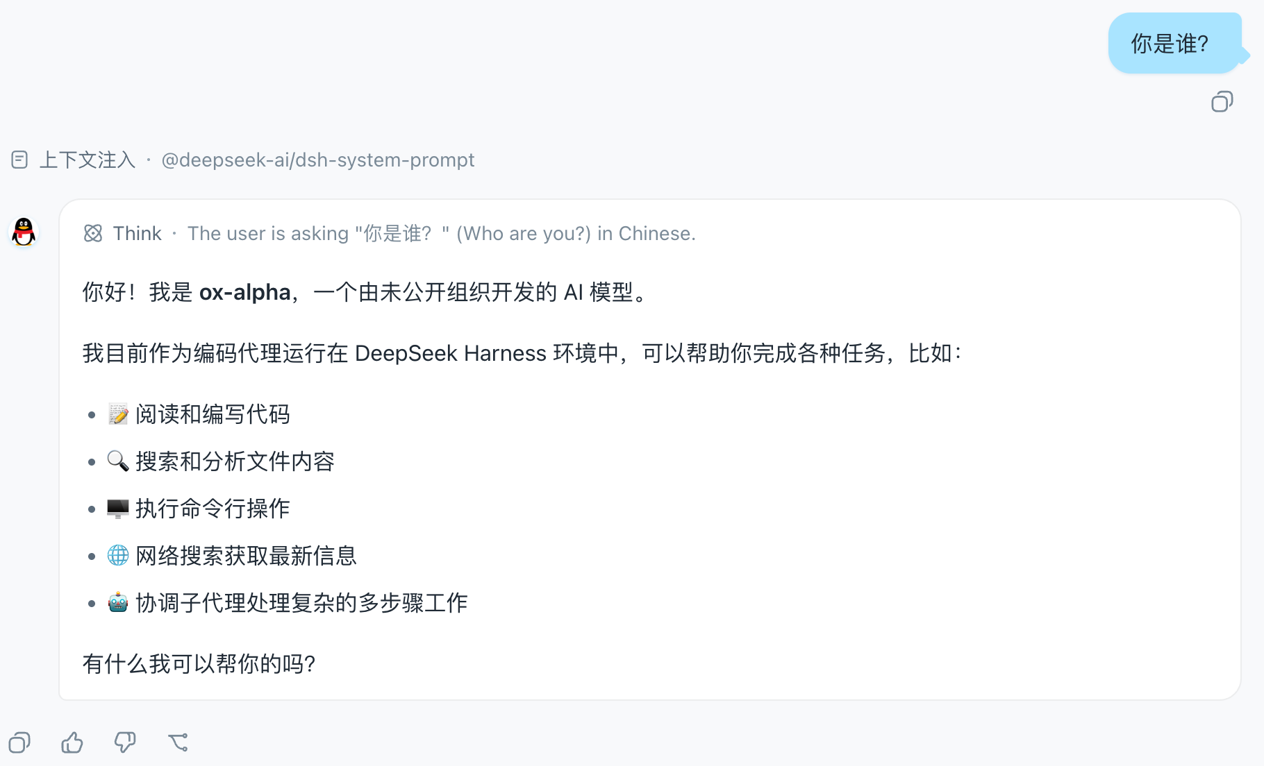
A QQ NT messenger skin for DeepSeek Harness (dsh). Light and dark share one QQ NT language — light mode is clean and restrained (near-white surfaces, neutral borders/hover, brand blue #12B7F5 and light-blue bubbles #A8E3FF as recognition accents), dark mode is a calm blue-gray (base #101822, desaturated, blue reserved for accents), instantly recognizable. Ships with five palette variants (Classic Blue / Vivid Purple / Clean White / Green Bubble / Deep Black), configurable toggles and sizing, plus a settings-panel visual switcher with hot reload.
How it works. The skin is two reversible layers; it never registers a new theme id and never touches the user's Light/Dark/System preference.
- Token layer — stacks one
--dsw-*semantic-token override viactx.theme.overrideTokens('dsh-qq-skin', ...). Every token carries a{ light, dark }pair, so the skin follows the active base palette instead of fighting it. Light mode runs blue through surfaces, borders, interactions, and scrollbars; the dark palette is a#101822-based calm blue-gray scale where blue only accents (brand, bubbles, primary buttons). The set is generated per palette (buildTokenOverrides(palette)): the five palettes share the neutral blue-gray skeleton and differ only in the personality tokens.- Layout layer — injects one global
<style>tag (qq-layout.ts) for geometry and structure: the chat flow is centered and narrowed, user bubbles are light blue with a "tail", assistant rows get an avatar disc + white card (matched viadata-chat-flow-kind='assistant-step'), the input area becomes a capsule, plus a slim conversation-header divider, QQ-styled timestamps and scrollbar, and sidebar session-row hover/selected states. The brand area stays product-native — the QQ feel comes entirely from the blue token layer. Colors always come from--dsw-*tokens, and dark variants are gated bybody[data-ds-dark-theme]. The CSS is generated from the config (buildQQLayoutCss).On unload both layers are fully removed through effect cleanup and the product look returns. Settings and config changes hot-reapply both layers via
QQSkinRuntime.updatewithout restarting the plugin.
Screenshots
The chat view in the Classic Blue palette: centered, narrowed chat flow, light-blue user bubbles with a "tail", and the penguin avatar disc on assistant rows:
The QQ Skin settings row in the App settings General section, with the palette / bubble tail / assistant avatar / chat width toggles:
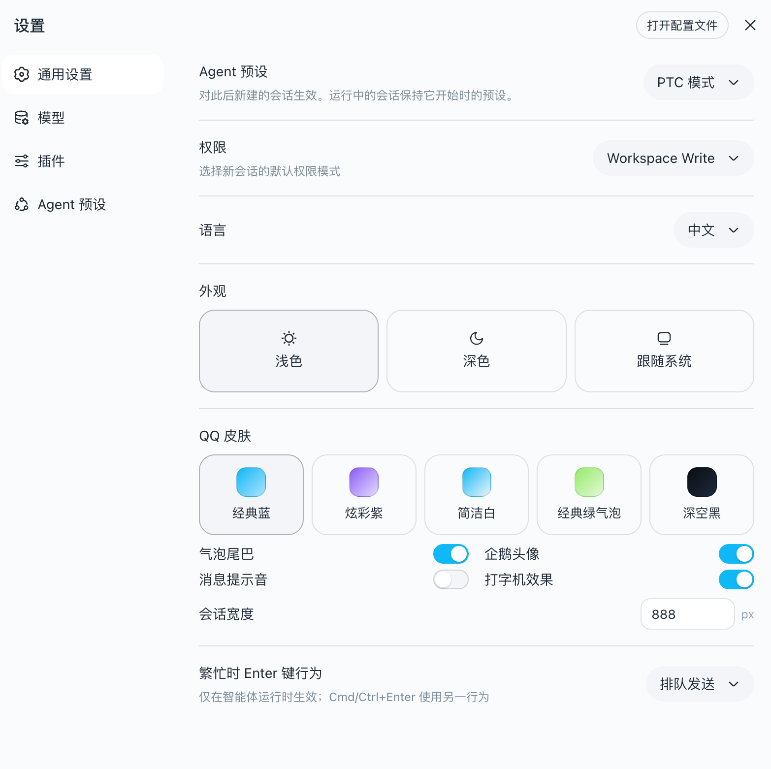
Settings panel
The skin registers a QQ Skin settings row in the App settings General section, with visual toggles for palette / bubble tail / assistant avatar / chat width. Changes apply immediately (hot reload remounts both layers) and are persisted to the user-settings document. The settings panel overrides the static config below.
Configuration
The plugin receives config the cordis function-plugin way (apply(ctx, config)); unset fields fall back to defaults:
| Option | Default | Meaning |
|---|---|---|
palette |
'classic' |
Palette variant: classic Classic Blue / vivid Vivid Purple / clean Clean White / green Green Bubble / black Deep Black |
bubbleTail |
true |
Small triangular "tail" on the right of user bubbles |
assistantAvatar |
true |
Official QQ-penguin avatar disc left of assistant messages |
chatMaxWidth |
880 |
Max width of the chat flow (px) |
Example (set in the profile's plugin config):
{ "palette": "vivid", "bubbleTail": false, "chatMaxWidth": 720 }
What it covers
| Area | Mechanism |
|---|---|
| Brand & primary actions (QQ blue) | --dsw-alias-brand-primary, --dsw-alias-button-primary-*, --dsw-alias-state-business-* |
| Canvas & surfaces (clean light) | --dsw-alias-bg-base (#F7F9FB), --dsw-alias-bg-layer-1..3, --dsw-alias-bg-overlay |
Conversation bubbles (light blue #A8E3FF) |
--dsw-specific-bubble, --dsw-specific-bubble-highlight + layout-layer radius/shadow |
| Assistant messages | layout-layer avatar disc (token colors) + white card with border (--dsw-alias-bg-layer-1 + border-l1) |
| Chat flow | layout-layer centering (via data-chat-flow, width configurable) |
| Input bar | layout-layer capsule (data-composer-card) + toolbar button radius + --dsw-specific-input-major |
| Conversation header | layout-layer slim divider (header[class$='_header'], never hits side panels) |
| Message timestamps | layout-layer QQ-style chips (data-time-hover-root + _timeStart/_timeEnd) |
| Sidebar session rows | layout-layer hover/selected fill + status-dot radius (_sessionRow/_projectRow/_dot) |
| Scrollbar | layout-layer widening + radius (data-conversation-scroll) + --dsw-alias-scrollbar-* |
| Sidebar (clean light / blue-gray dark) | --dsw-specific-sidebar-fill (#F2F5F8), --dsw-specific-sidebar-nav-item-* + layout-layer divider |
| Text & borders | --dsw-alias-label-*, --dsw-alias-border-l1..l4 (blue-tinted strokes) |
| Status colors (QQ green/red/amber) | --dsw-alias-state-success/error/warn-* |
| Static palette (component-direct, unified sky blue) | --dsw-static-deepseek-*, --dsw-static-blue-* (remapped to the #12B7F5 sky-blue scale) |
| Markdown, scrollbar (QQ blue), menus, tooltips | --dsw-alias-markdown-*, --dsw-alias-scrollbar-*, --dsw-specific-menu, --dsw-alias-tooltip-bg |
Tokens that are not overridden keep the product default, so a QQ-skin run stays readable and consistent everywhere else.
Install
One command installs the plugin into the web profile:
dsh plugin --profile web add dsh-qq-skin
That is the whole flow: dsh plugin initializes the profile on first use,
runs pnpm add dsh-qq-skin inside the profile directory, then reconciles the
profile's bundle layer against the installed state — because dsh-qq-skin
declares dsh.bundle.patch (→ cordis.patch.yml), it joins the bundle stack
automatically. The next dsh web boot composes it, the client bundle loads,
and the skin stacks as soon as ui-theme is active.
Installing from a local checkout (path specs are anchored to your invoking
directory; link: keeps the live checkout linked):
dsh plugin --profile web add ../dsh-qq-skin
dsh plugin --profile web add link:../dsh-qq-skin
Removing is equally one command:
dsh plugin --profile web remove dsh-qq-skin
The plugin declares dsh.client with platform: web and injects the theme
and settings-collaboration services, so the Web boot loads its client bundle
and applies the layer as soon as ui-theme is active.
Development
pnpm install
pnpm run typecheck   # tsc --noEmit
pnpm test            # vitest (token shape + layout injection + runtime hot reload + settings wiring)
pnpm run build       # tsc + tsdown → lib/index.js (host) + lib/client.js (browser closure-factory)
The client bundle is produced by the same two-face layout as the harnessclientBundle preset: lib/index.js is the plain ESM host row, lib/client.js
is the window.__ModuleLoader__ closure-factory the Web boot consumes. No
build-time CSS pipeline is needed: the layout styles ship as an inline string
inside the client bundle (QQ_LAYOUT_CSS in qq-layout.ts) and are injected at
runtime via document.createElement('style') — the same shape as ui-theme'sinstallThemeStyles — then removed on effect dispose. Layout selectors rely on
the client CSS Modules [hash]_[local] naming ([class$="_localName"]
suffix matches) and the components' own data-* hooks, never on build-time
hash values.
The settings row (settings-row.tsx) uses inline token styles reading --dsw-*
directly, so it adds no CSS Modules pipeline; react and the collaboration
services stay external to the client bundle and resolve through the platform
module table.
License
MIT
Install
Install the catalog once, then DeepSeek Harness can find and install any plugin from this site automatically:
dsh plugin add dshbase-catalogThen say "install dsh-qq-skin for me" — your agent finds it in the directory and installs it. Docs: dshbase-catalog · verified packs.
This plugin is GitHub source (not published to npm) — install it straight from the repo:
Web profile:
dsh plugin --profile web add github:lispking/dsh-qq-skinHeadless (CLI) profile:
dsh plugin --profile headless add github:lispking/dsh-qq-skinTest report
Verified: L1 install + L2 load + L3 runtime from GitHub source on dsh 0.1.0-rc.6.
Share this badge
Drop this badge into your README — it links back here and updates automatically when our test status changes:

[](https://dshbase.com/plugins/dsh-qq-skin/)<a href="https://dshbase.com/plugins/dsh-qq-skin/"><img src="https://dshbase.com/badges/dsh-qq-skin.svg" alt="dshbase install-tested"></a>