
插件目录 / UI & Skins / dsh-navbar
dsh-navbar
已验证 · 实测可装 vlln
功能简介
DSH 插件:对话节点导航条,右侧节点串可快速跳转 user 消息。
已归档 — 不再维护,谨慎使用
该插件已归档、不再维护——除非你愿意自己维护,否则慎用。
「已验证」表示我们的自动化 CI 在干净 profile 里实际执行了 dsh plugin add 并启动成功——仅此而已。功能描述与版本兼容性均为作者声明。这不是安全审计,也不代表对第三方代码的背书。
README
ARCHIVED (read-only) — The official DSH web shell shipped a built-in Turn navigation rail in the 0.1.2 series (npm
@deepseek-ai/dsh≥ 0.1.2-rc.1; upstreamfeat(ui-chat): full-session turn rail with load-and-jump, b3064cca): aTurnNavigatorrail with hover previews, click-to-jump, reading-position tracking, and jump-loads for unloaded turns. The core capabilities of this plugin are now covered by the host, so this repository is archived. Historical implementation remains indocs/and the git history.
中文 | English
navbar
Conversation node navigation rail: jump between user messages from the node strip on the right edge of the conversation — hover to preview, click to jump

An evenly spaced node strip along the right edge of the conversation area (one node per user message): the active pill follows your reading position, hovering shows a preview card (truncated at 6 lines), clicking smooth-scrolls with a brand-blue highlight ring, more than 30 nodes switch to a fixed 30-node window with count badges (↑N/N↓) at the ends showing how many are hidden, it stays invisible until hovered, and it auto-hides only when no user message is loaded — in that case it automatically loads earlier history until at least one user message appears (or history runs out). Implements the dsh-external/issues#144 spec. Form: an official bundle plugin (dsh.bundle + dshClient channel, browser-only, empty Node half), 0 patches.
Preview
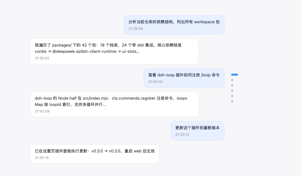
Features
| Feature | Description |
|---|---|
| Node navigation rail | Vertical node strip on the right edge of the conversation area, one dot node per user message |
| Follows reading position | The active pill (22px brand-blue capsule) moves with your current reading position |
| Hover preview | Hovering a node shows a message preview card (6-line truncation, matching the official HoverCard look) |
| Continuous hover | The entire rail (including the gaps between nodes) responds to hover continuously: the preview switches to the nearest node and the corresponding pill elongates (gray) to indicate the click target — no dead zones |
| Scroll-wheel switching | With the cursor over the rail, scrolling the wheel moves up/down one message (blocking conversation-area scrolling) |
| Click to jump | The whole rail is clickable (including gaps, jumping to the nearest node) plus an enlarged pill hit area — no need to precisely aim at tiny dots |
| Fixed window + count badges | More than 30 nodes show a fixed 30-node window (the active node stays centered, clamped at the ends); count badges (↑N / N↓) at the window ends show how many are hidden — the visible node count stays constant. Pinned golden discs always stay visible (the window expands to include them) |
| Load earlier history | An ↑ button pinned at the top of the rail (visible only while the conversation has older history): click to load earlier messages — it forwards to the official load-older control, so your reading position is preserved. Hovering it instantly shows a hint card in the same style as the node previews (the official HoverCard look) |
| Auto-hide | Not shown with no user message loaded (or on non-conversation pages). With zero user messages loaded, the rail automatically loads earlier history until at least one user message appears (or history is exhausted) — so the rail always has something to navigate |
| Message pin | 📌 button on the assistant action bar (between copy and Good response); pinned turns render as a golden slim elliptical disc in the rail (always visible, the preview card carries a 📌 badge, clicking jumps straight to the pinned reply), persisted per session |
Zero data-channel dependencies: driven only by official anchor attributes (data-time-hover-root, on user rows since 0806) — no polling, no routing, no tools.
Installation
Recommended: one-line install from git source (build artifacts are committed, so git source does not trigger a build):
dsh plugin --profile web add "github:vlln/dsh-navbar#main"   # one-line git-source install (build artifacts committed)
# or npm source: dsh plugin --profile web add @vlln/[email protected]
Or from a local directory (when you have the source): git clone, then cd dsh-navbar && dsh plugin --profile web add ..
Restart web after installing for it to take effect; you can disable/enable it in the Plugins panel on the Settings page.
Usage
Works out of the box — no commands, no tools. The node rail appears on the right edge of the conversation page (Chat view); hover for a preview, click to jump. Animations are disabled under prefers-reduced-motion.
Pin: hover an assistant message's action bar and click 📌 to pin that reply — the corresponding turn's navigation node becomes a golden slim elliptical disc (click to jump straight to that reply; the preview card shows a 📌 badge and the reply text). Pin state is saved per session in browser localStorage and survives refreshes; click again to unpin.
Load earlier history: when the open conversation still has older messages (its history window is not fully loaded), an ↑ button sits at the very top of the node rail. Click it to load the earlier messages — the rail then grows new nodes at the top. The button hides automatically once all history is loaded, and is disabled while a load is in flight. Hovering it instantly shows a hint card in the same style as the node previews (the official HoverCard look), and it reads "Loading…" while a load is in flight. The click is forwarded to the official load-older control, so your current reading position is preserved (no content jump).
Development
pnpm install
pnpm run build      # tsdown: client bundle (lib/client.js)
- client:
src/client/index.ts(self-rendered DOM + official anchor contract; the pin button uses the officialconversation.chat.assistant-actionsslot, with React provided by the client runtime; ctx services accessed must be declared in the plugin object'sinject) - Node half:
src/index.mjs(empty apply, the bundle mount carrier)
License
MIT License (an example plugin in the DSH ecosystem).
安装
装一次目录插件,之后本站所有插件都能让 DeepSeek Harness 自动找、自动装:
dsh plugin add dshbase-catalog然后对 agent 说「帮我装 dsh-navbar」,它会在目录里找到并自动安装。文档:dshbase-catalog · 已验证场景包。
该插件是 GitHub 源码(未发 npm)——直接从仓库装:
Web profile:
dsh plugin --profile web add github:vlln/dsh-navbarHeadless(CLI)profile:
dsh plugin --profile headless add github:vlln/dsh-navbar实测报告
验证通过:从 GitHub 源码完成 L1 安装 + L2 加载 + L3 运行(dsh 0.1.0-rc.6)。
使用场景
改变 dsh 的外观或交互方式——一套主题、皮肤或新面板,重塑工作区。
适合谁
在 web UI 里一待几小时、想让它按自己的习惯好看又好用的人。
二次开发建议
皮肤、面板和主题 token 是扩展点——写新皮肤、加面板,或与上游配色同步 token。
分享徽章
把这枚徽章粘进 README——它会链回本页,实测状态变化时自动更新:

[](https://dshbase.com/zh/plugins/dsh-navbar/)<a href="https://dshbase.com/zh/plugins/dsh-navbar/"><img src="https://dshbase.com/badges/dsh-navbar.svg" alt="dshbase 实测可装"></a>